


A year after Eventbrite’s rebrand there were parts of the system that weren’t working well and needed to be revised. A small Creative Studio team was formed to tackle these issues and I lead the exploration and update to our brand color palette.
For the edgy palette, we knew we’d be using it primarily for Eventbrite Music so we chose a new pink that is closer in color to a xerox punk flyer so that the palette feels edgier. We decided to nix the grey all together because it was hard to use and replace it with a tonal purple that works well for background patterns.
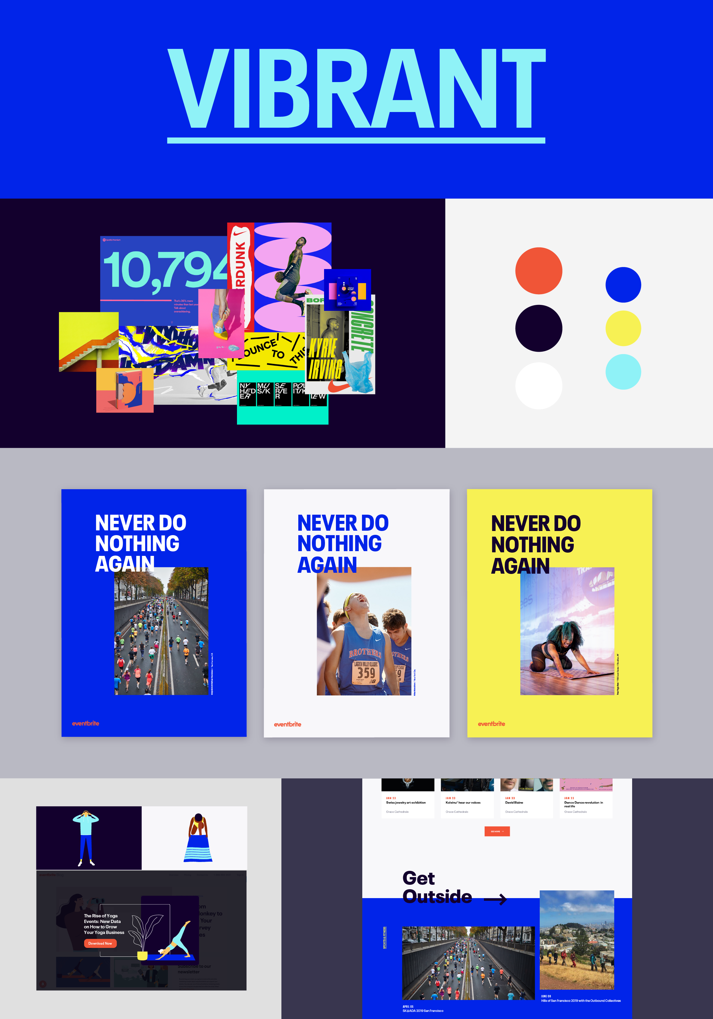
The original vibrant needed a complete redo because it felt dated and the colors ended up not working well together. The vibrant palette is used primarily for sports events and outdoor festivals so we went for colors that were bright, energetic, and fresh.
Smart was the hardest palette to create but one of my favorites. It also needed a complete redo once we realized it didn’t work well with the overall system. We went through a lot of different variations of this palette but decided that we really wanted a green/teal in the palette and then built the rest of the palette around the lead teal color. Smart is used primarily for classes and lectures so it needed to feel professional and intellectual but not boring. We nailed it!